D2L Wave Payments Redesign: Unifying the Payment Experience
E-Commerce // System Analysis // UX // UI
Summary
December 2023 - October 2024
The Challenge: D2L Wave's fragmented payment methods created drop-off and blocked partnership growth. Employees waited up to a week for discount codes, or paid out-of-pocket for reimbursement. Meanwhile, the business had no visibility into our primary revenue stream.
The Solution: Integrated Stripe payments directly into the platform, unified user workflows and gave the business control over transactions.
Timeline: December 2023 - October 2024 (9 months)
My Role: Product Designer
Team: 2 Product Managers, 4 Engineers
The Impact:
⚡ 85% faster enrollment (1 week → 1 day between approval and registration)
📉 60% reduction in payment-related support tickets
⏱️ 10 hours → automated monthly revenue reconciliation
🎯 45% reduction in financial widget complexity
The Problem
D2L Wave (now SkillsWave) is a B2B corporate learning platform that removes barriers for employees to access high-quality continuing education courses and programs.
When D2L Wave launched, we offered courses through Education Partners who had different payment infrastructures, resulting in two fragmented payment methods that created friction for users and risk for the business.
Method 1: Discount Codes
Employees wait ~1 week for Education Partner Administrators to generate a discount code in their own systems. Once received, employees would navigate to the Partner's website, enter the code, and complete registration.
Method 2: Pay Upfront
Employees pay out-of-pocket on the Partner's website and seek reimbursement through their company's internal processes
Pain Points
Insights learned during usability testing with Employees & meetings with Education Partners
Employees
Waiting for discount codes was tedious and time consuming, and upfront payments could cause awkward scenarios when Employees couldn’t afford the payments, even after their manager had approved their application.
Education Partner Administrators
Generating discount codes and creating revenue share reports was time consuming. Admins were also being fielded payment questions better suited for D2L Wave, or the Employee’s company.
Business Problem
Both payment methods shared a critical flaw: Payments occurred on the Education Partner's website, making the business dependent on partners to accurately track enrollments and pay revenue share.
Revenue share was our only income source, and the lack of visibility created significant business risk.
Proposed Solution
We decided to handle all payments directly on the D2L Wave platform through Stripe integration. This would enable us to:
Unify the user experience for Employees
Reduce drop-off rates and technical debt
Gain full visibility and control over our revenue stream
Expand to US Education Partners (requiring multi-currency support)
Reduce administrative burden for Education Partners
What I Did
Phase 1: Discovery & Proof of Concept
I created high-level journey maps to visualize the end-to-end experience and drop-off risks. I met with our Education Partners and used the visuals to facilitate conversation.
Why I Did It:
We needed Partner buy-in for such a major platform change, but more importantly, we had conducted minimal research with Partners and needed to understand their pain points and concerns, and whether our proposed solution worked for them.
Result of This Phase
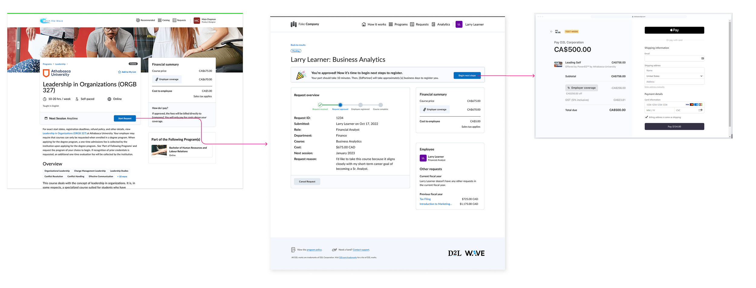
The journey maps facilitated productive conversations and gave us the insights needed to move forward confidently. I learned that we would still need users to create an account on the EdPartner’s website the first time they enrolled due to EdPartner constraints. I understood the requirements, and could iterate on a new workflow, which we ended up getting approved by Education Partners:
Making our users create an account on our Education Partners website as part of our e-commerce workflow was not ideal. I identified potential risks as well as things our team was still uncertain about. Despite this concern, our new workflow fixed many existing user and business problems and we decided to move forward.
Phase 2: Financial Widget Redesign for Multi-Currency & Tax
Context
A primary feature of our platform was that Employees could see how much of their employee education benefit they had left, so Employees understood whether they’d need to pay out of pocket. We were partnered with some American institutions who charged in US dollars (our primary user base was Canadian). Stripe's internal currency conversion algorithms prevented us from fetching real-time rates, meaning we could only display approximate conversions before checkout.
Competitive Analysis:
I conducted extensive analysis of e-commerce patterns, relying heavily on Shopify's Polaris design system (which provides in-depth guidance on multi-currency displays) and examined how various apps and online stores handled currency conversion.
Usability Testing:
I created design concepts and ran two rounds of testing to validate participants' understanding of currency conversion, focusing on critical questions:
Do you understand how much money your company is covering?
Do you understand how much employer coverage you'll have remaining?
Will you need to pay out-of-pocket, and if so, how much?
Do you understand the currency conversion?
Result:
After two rounds of iteration, testing showed that users clearly understood foreign course costs in their own currency and felt confident about how much they'd pay. The design successfully navigated the constraint of showing approximate conversions while maintaining user trust.
What I Learned:
The research reinforced that employer coverage visibility was non-negotiable for users making course decisions. Currency conversion needed to be transparent but couldn't add cognitive load to an already complex financial calculation. Users appreciated upfront honesty about approximate conversions rather than exact numbers that might change.
Phase 3: System Design—Widget Variations & Consolidation
What I Did:
Our financial widget had 11 variations based on:
Workflow stage (browsing, pending approval, approved, payment)
Company budget settings (upfront coverage visible vs. revealed at approval)
Course characteristics (domestic/foreign, taxed/non-taxed)
I had previously mapped all workflow stages and widget states in the old system. Using this as a foundation, I identified where and how the widget needed to change for the unified payment workflow.
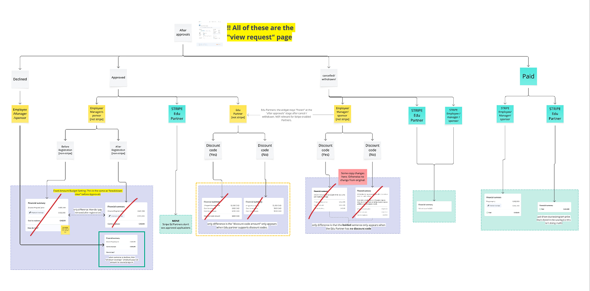
Result
I remapped widget variations for the new workflow and eliminated 6 of the 11 states. I consolidated redundancies and aligned states more closely with actual user decision points. This reduced tech debt, decreased QA testing needs, and created more consistency for users.
Outcomes & Impact
By the end of the project we successfully integrated a seamless payment process on the D2L Wave platform, eliminating the fragmented experience and unblocking our ability to scale the Education Partner network.
Within a month of release, we onboarded 5 new Education Partners (a 100% increase on our existing network). In future usability testing we heard vastly improved feedback about the payment experience.
User Experience
⚡Time-to-enrollment: 1 week → 1 day (85% improvement)
📧 Support tickets: 60% reduction in payment-related issue
✅Eliminated expired discount code complaints (~10/month)
🎯 Unified flow: Single consistent payment experience across all partners
Business & Operations
💰 Full revenue visibility by processing payments on-platform
⏱️ 10 hours → automated monthly partner revenue reconciliation
🚀 Unblocked partnership scaling regardless of partner infrastructure
🔒 Eliminated dependency on partners for accurate revenue reporting
Design & Technical Quality
🎨 Widget variations: 11 → 6 (45% reduction)
🔧 Decreased technical debt through consolidation
📐 Established scalable patterns for multi-currency displays
Lessons Learned
Visual Artifacts Create Shared Vocabulary with External Stakeholders
The high-level workflow diagrams I created for Education Partner discovery became invaluable communication tools throughout the project. They gave us a shared language and helped non-design stakeholders visualize complex system changes. This approach worked so well that I've made it standard practice for any initiative involving external partners.
Transparent Communication Builds Trust When Perfect Solutions Aren't Possible
We couldn't show exact currency conversions due to Stripe limitations—a less-than-ideal UX. However, being transparent with users about approximate conversions and explaining that the final amount would be calculated at checkout maintained trust.
Sometimes the best design solution is honest communication about constraints rather than hiding them.